MTV3 in Finland offers a mix of general entertainment and news. The name stems from the Finnish word for advertising, Mainos, and the 3 because it is the nations’ third channel. Launched in 1957, MTV3 had a warm and friendly personality, important to help carry Finns through the long, cold winters. This perception was helped by the symbol of the channel, an owl. Originally the logo was the cutest little blue owl made entirely out of circles but as this was thought to be too childish, it evolved over the years, eventually becoming a single abstracted eye in red and black. While this feels quite cool and modern, the friendliness was somehow lost in the transition and it was our job to bring that back.

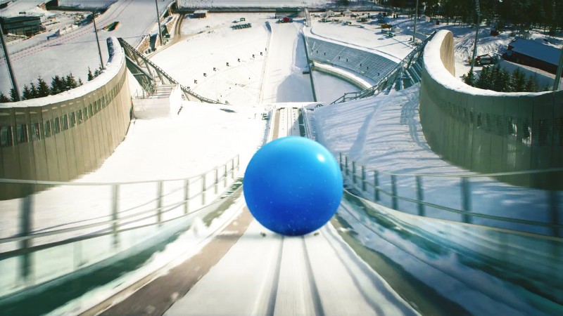
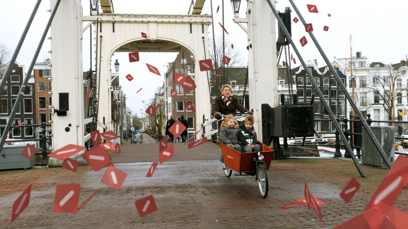
We decided on a two-pronged strategy. In the first instance we produced a series of low cost animated stings that featured the logo trapped in various witty situations. The initial set formed the basis of a library that could be added to ad infinitum.


Secondly, we filmed a series of much longer idents that could be used in conjunction with a presentation voice over. The idea for these came from our then Creative Director Mark Gardner, who went on to win an Emmy for his MadMen titles. He observed that owls have the ability to turn their heads and view the world in 360º. This matched the 360º programming schedule and outlook of the station.

Filming took place in and around Helsinki, the camera on circular tracks recording choreographed scenes of swimmers, canoeists, skateboarders, and markets - things close to Finnish hearts. The presentation packaging followed the same theory with programme clips sliding along a 24-hour timeline. MTV3 has maintained a consistent brand, for which Kemistry created the foundations, which has enabled them to position themselves to be the leading news and current affairs provider in Finland.


